wedding social media boards
INTRODUCTION TO THE PROJECT
For this project, I was approached by my aunty, who was currently planning her wedding at the time, to create social media boards that would be displayed at the entrance of the wedding for her guests to see as they entered the venue.
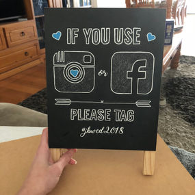
The purpose of these boards were to encourage guests to post on social media photos from the day using the chosen hashtag of #jbwed2018. This included Instagram and Facebook as social platforms to be used for posting the photos so that the bride and groom could look back through this hashtag and relive the day through the eyes of their wedding guests.
CONTENTS OF THIS PROJECT

RESEARCH
When approaching this project the first thing that I did was research into other social media boards that had been used at other weddings, particularly on Pinterest, to see the different styles that had been designed previously and which ones might be similar to what my client wanted for her own wedding. Through research it became apparent that there was a clear difference in styles, mainly high-quality printing and exquisite DIY boards that had been constructed. As there wasn't a huge budget set aside for these boards I had to focus more on the DIY options and styles. This also included finding a way to make them still look professional with the materials that I had been supplied with by the client: multiple blank mini chalkboards and white chalk.
PROGRESS OF PROJECT
This was definitely a project I struggled with to get it to a final design that I was happy with. There was a lot of changes made when it came to the materials that I used for the boards as can be shown below in the progress photos. When I first started this project my idea was to put down the basic outlines on the mini chalk boards that I was given and shade in each area with the chalk supplied. I mocked this up in photoshop (which you can see in the first two images) however when I went to actually put this into action the chalk wasn't high quality and so it didn't apply very well. This made the chalk sections look very spaced out and inconsistent, which wasn't the look I was wanting
The second option I tried was using paint pens instead of chalk to fill in each area and outline the design after putting a base outline on with chalk. This was also harder than I expected to execute into the idea that I had in my head. I went out and bought paint pens but ended up buying ones that were way thicker than what I needed for the project. As a result of this, I found myself going out of the lines often and trying to fix it up just took it further and further away from the clean design that I had planned for. With the paint pens I first tried colouring as I would with a normal marker but this left me with a thin layer of paint that did not produce a solid colour. I changed my technique and tried to cover each section with dotting the boards with the pen as it came out thicker, however it produced an bumpy layer of paint on the boards and was way too time consuming considering the result wasn't pleasing.
From what I had learnt previously, I had figured out what had gone wrong and where I needed to change things up so the third attempt and technique ended up being the best and final one. I had done a technique in school to transfer outlines onto canvas or paper where I would cover the back of a piece of paper with a thick layer of dark lead and place it lead side down onto the material I wanted to transfer it onto. Tracing back over the image with lots of pressure pushed the lead into the surface below it and left an imprint of where I had been tracing. I used this on this project but instead of using lead I covered the back of the paper (with the design printed onto it) with the white chalk I had previously used and then transferred the chalk onto the board, creating thin chalk lines inside the lettering and icons that I wouldn't have been able to achieve with the thickness and angle of the normal chalk. I ended up going back out and buying a thinner white paint pen and was able to use this as outlines to bring some contrast to the project and some thicker coloured paint pens from earlier to colour in the hearts on each design (blue and pink). This turned out a lot better than my previous tries and produced a project that myself and the client were very happy with.

FINAL ARTWORK


